Monarch Plaza
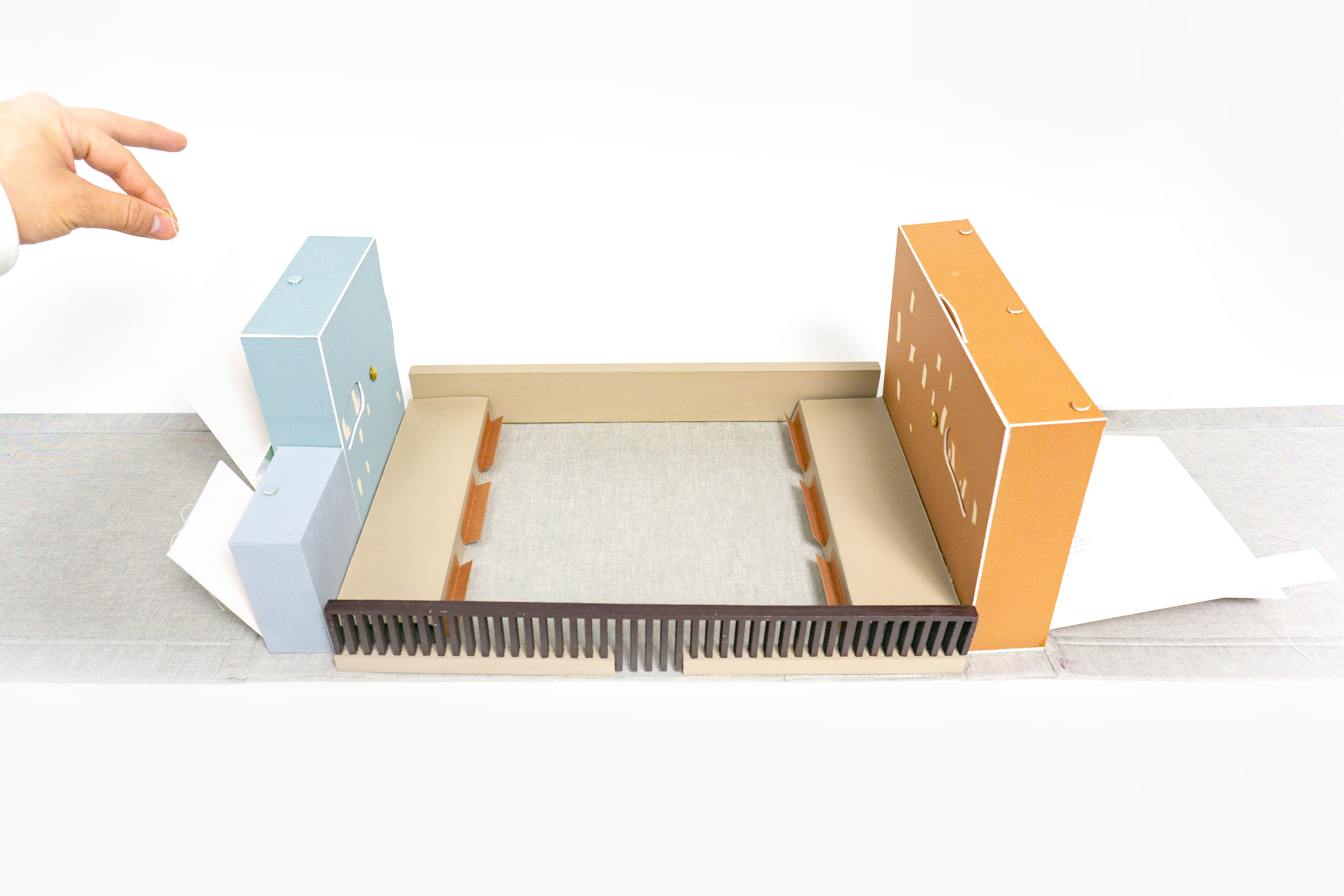
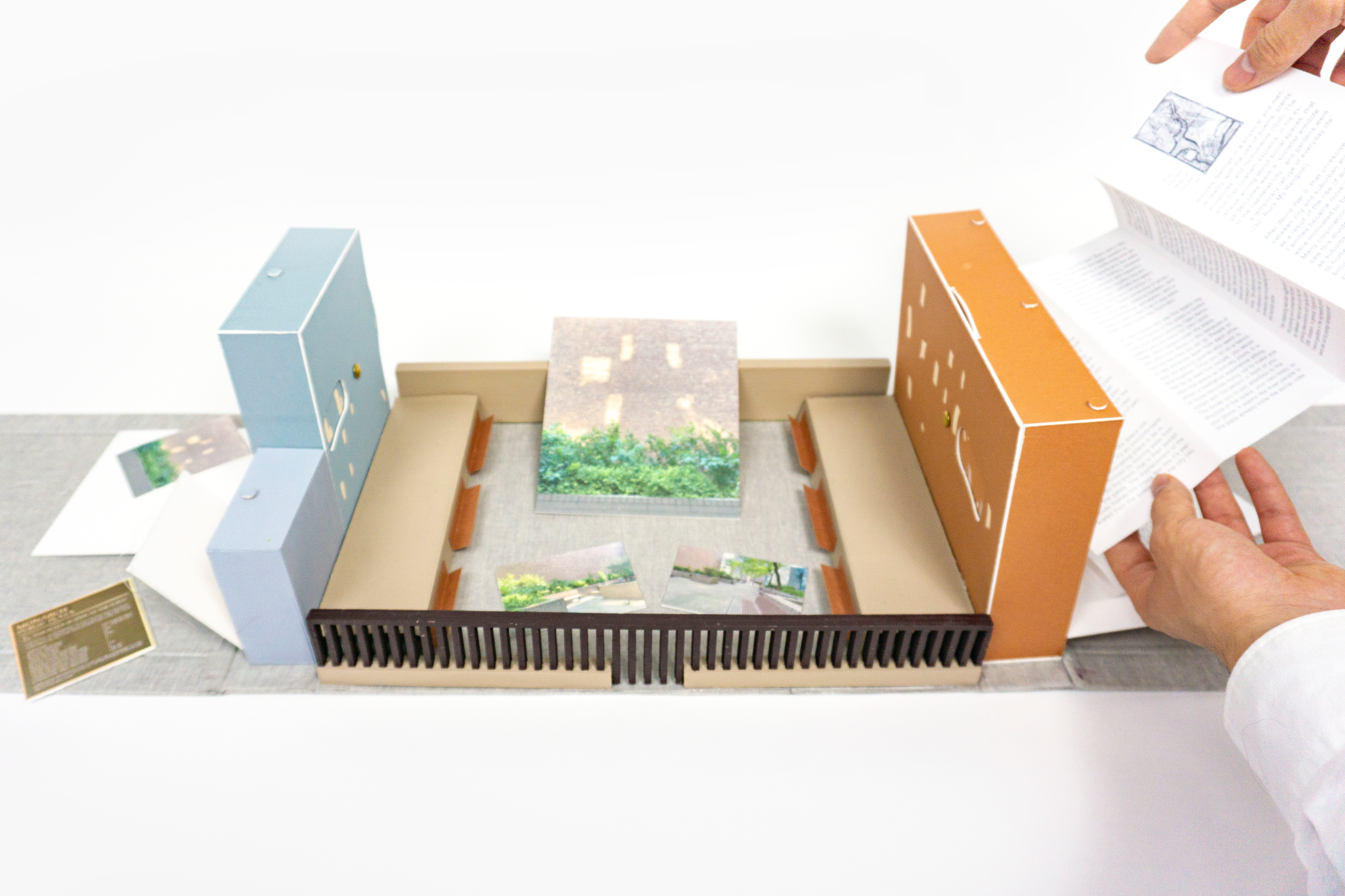
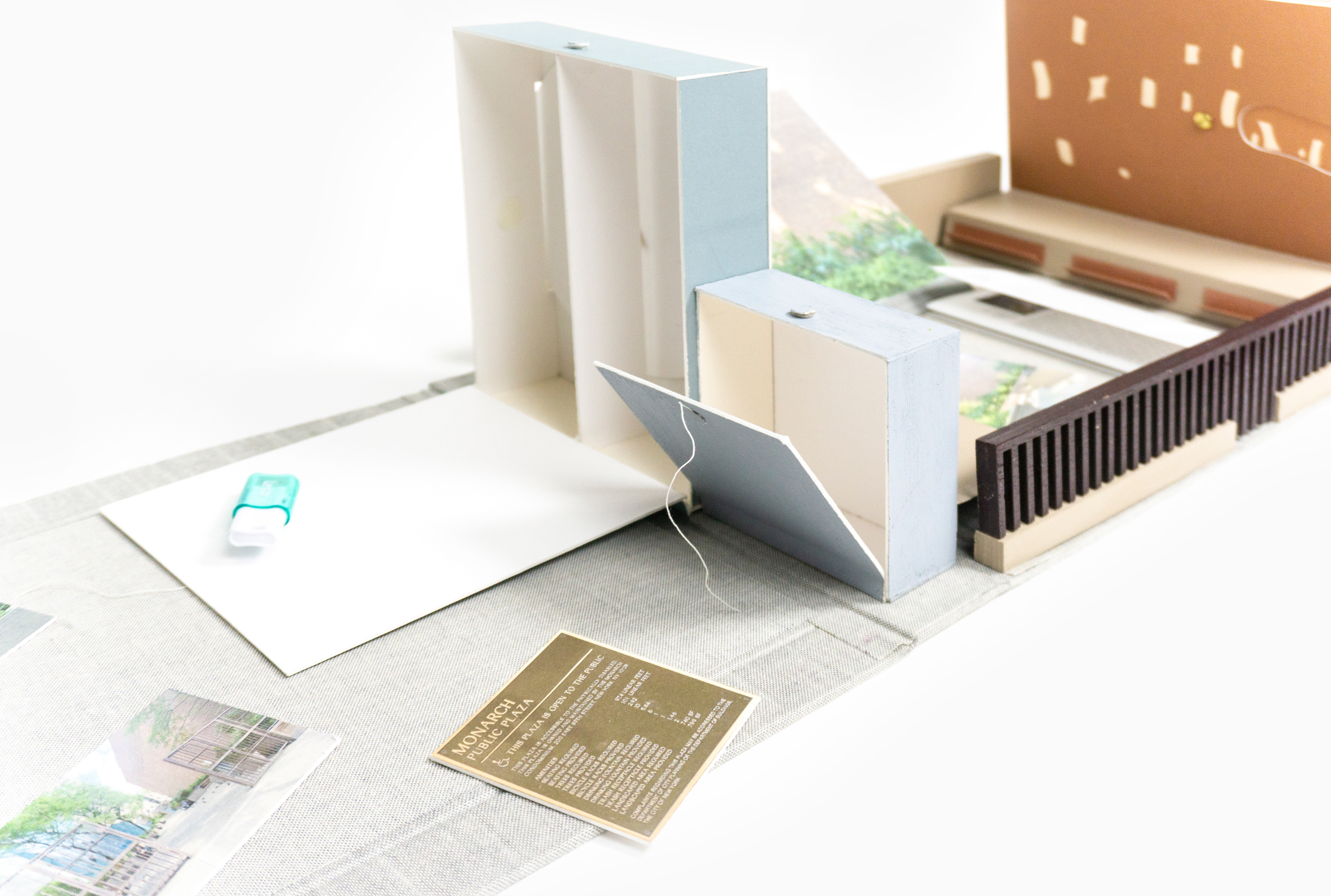
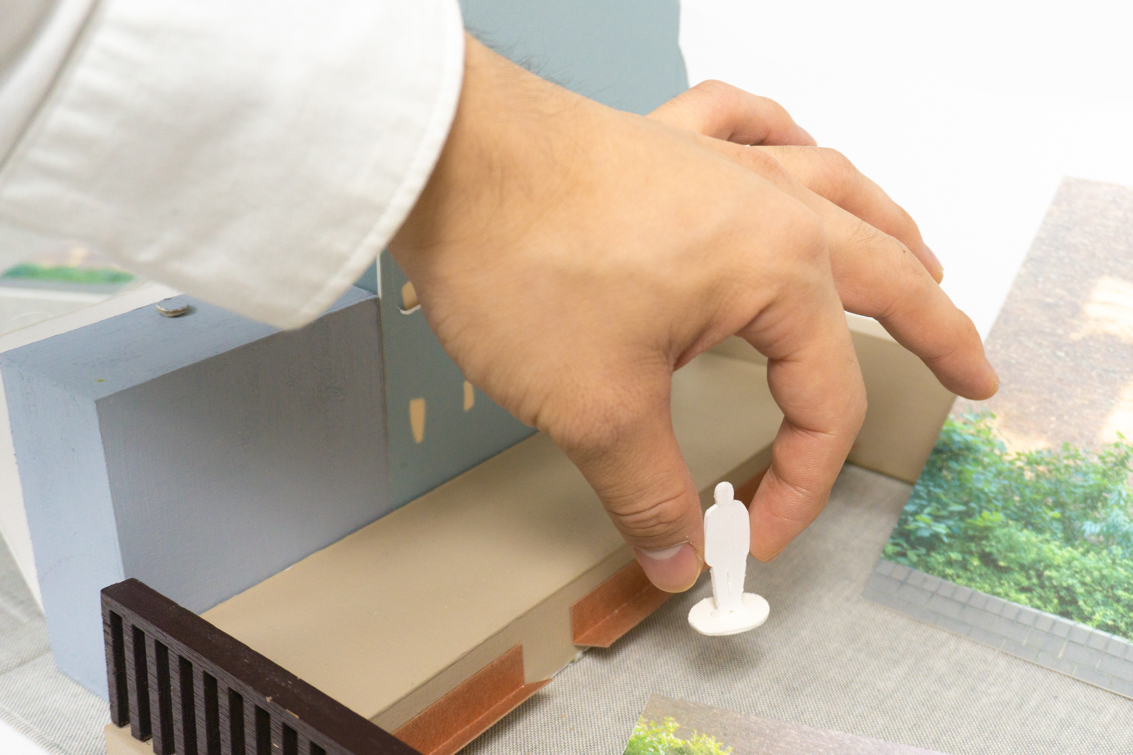
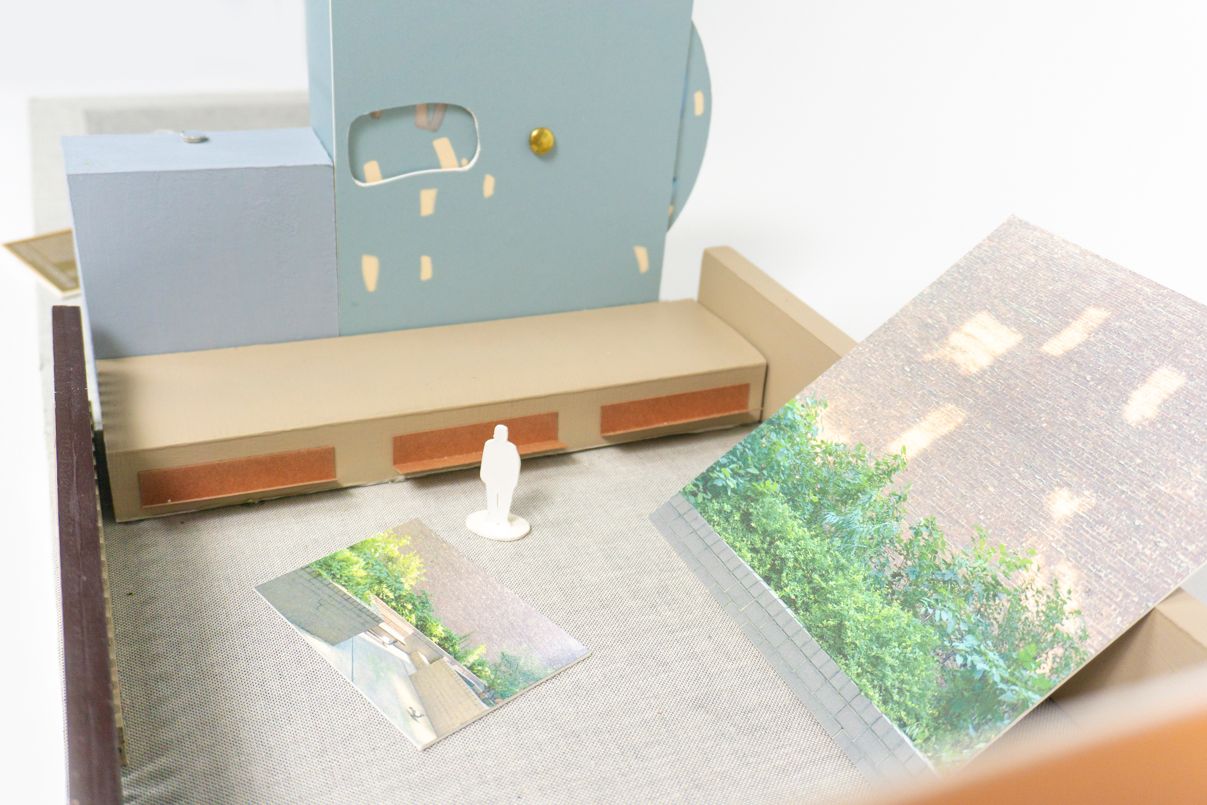
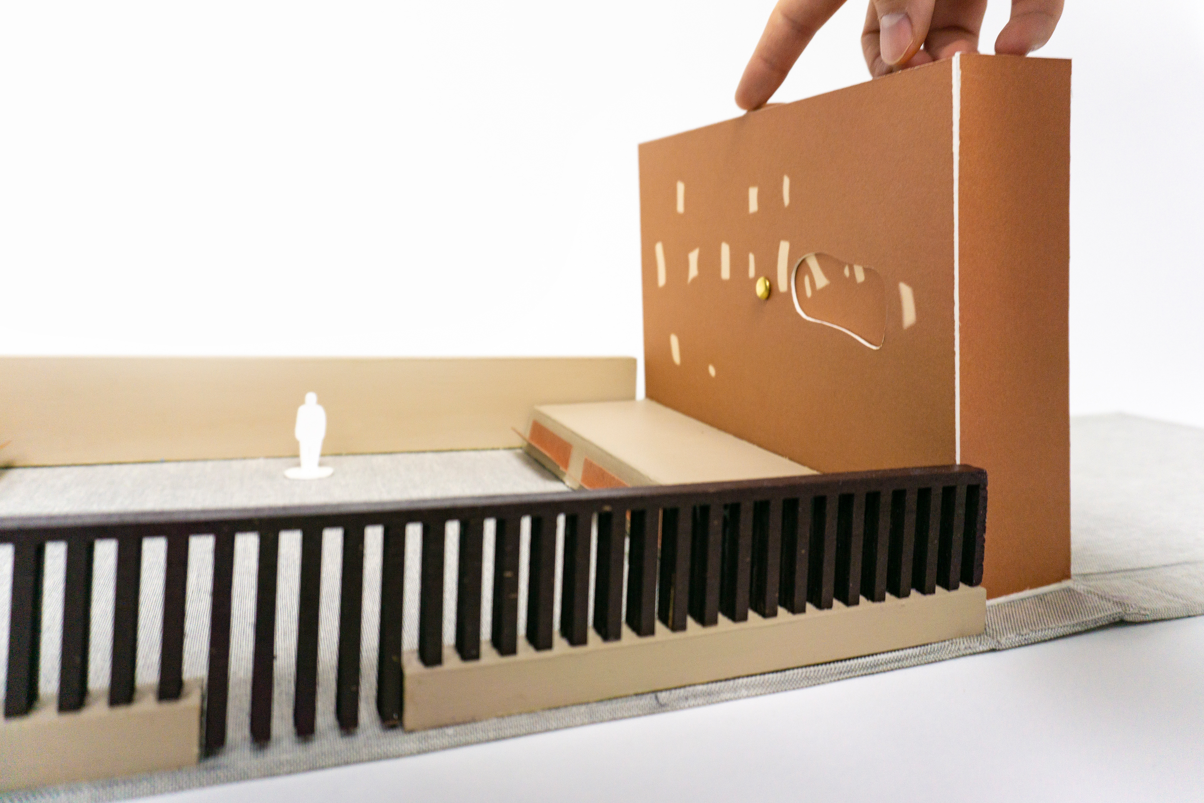
Monarch Plaza is a proposal in the form of a pop-up book of a looped two-channel video projection imitating the reflected lights on the walls of the actual site. As a response to the plaza’s displacement from the city, the video inserts a never-ending walk around the block that gains speed and sound distortion in the form of light reflections. The book contains props, images, research writing, and two volvelles of the videos.
Materials: Cloth, Matte Board, Wood, Paper, USBs, and String
Video demonstration of the book, and excerpts from Monarch Plaza (03:44mins):
Full video files of Monarch Plaza (13:41mins):
Monarch Plaza
Matthew Li
December 27, 2021
Situated on 88th Street and 3rd Avenue is a dark alleyway named Monarch Plaza. It opens
from 8am to 8pm, housing a number of trees, shrubs, and worn-out wooden benches facing
each other. Monarch Plaza sits on ordinary concrete and grey blocks that resembles a slightly
bent brutalist building. Surrounded by towering brick walls, the sounds of the plaza ricochet
from the large sienna and jail-like gates back into the plaza, creating disorienting sonic effects.
In addition, the walls from the neighboring buildings and slender trees shade a significant
amount of the space, making the plaza quite dark throughout the day. Every morning, however,
the brick walls are scattered with light reflections from the neighboring windows, acting as the
only slight source of light. Moreover, there are loud humming sounds emanating from vents that
drown out the chatter of people inside.
Although the name of the alleyway indicates it as a plaza—a space dedicated for public leisure
and gathering—it’s an uncomfortable place to be in. The sonic displacement and overshading
separate the plaza from the ambiance of the city into an insular site of its own. In addition, the
parallel benches create a confrontational situation between occupants, encouraging silence
and stiffness in people’s demeanor. Ultimately, these conditions, especially with the large gates
at the entrance, alienate the plaza from the city.
Many public spaces like Monarch Plaza do not necessarily serve the people; instead, its
offshoot design as a successful plaza reminds us of our social needs in a city, and our
relationship to the history of leisure spaces. Even though Monarch Plaza is a
government-owned space, it still has influences from corporate plaza designs, which resulted
from 18th Century European gardens that grappled with nature and cities.
In William Kent and Charles Bridgeman’s garden map at Stowe from 1739, for instance, there is
early evidence of an alternate city in nature [ Fig. 1]. The garden on the top half of the map
echoes the jagged roads of the city on the bottom half with the use of trees as borders for
paths. With enough distance from the city, one can contemplate the garden as a bucolic and
more “desirable” version of the city because of its context in nature. This physical distance was
also necessary at the time because of the city’s growing associations as a place of work (288,
Graham). As the artist Dan Graham explains, in response to those associations, that garden
cities were a “socialist antidote to the capitalist city” and “...a temporary refuge of everyday
life” ( 292, Rock My Religion). In other words, English gardens were an escape from the city.
Planners produced those feelings of escape by arranging plants, sculptures, and monuments
that reminded citizens of popular poems at the time to put them in a physical and mental
space alternative to that of the city (Ibid). Even though it was crucial to be physically distant
from the city, the garden’s echo of the jagged roads was an important connection back to a
social life in the city. It was a balanced space that was not a total isolation from a pre-existing
world.
After World War II, during the rise of automobiles, suburbs eventually grew out of those
gardens to move people out of the city, creating more divide between city and nature. Families
became more displaced and transient. Many corporations in America saw this divide as an
economic threat, as suburbs built shopping malls closer to homes. As a response,
corporations brought suburban arcadia back into the city as “urban plazas” or “atriums” to
attract people [Fig.2]. These urban plazas attempted to continue European gardens’ sense of
escape and connection back to a familiar social city; in the case of The Ford Foundation in
New York City, its atrium houses a number of plants under a glass enclosure so that occupants
can be in nature and still see the larger city outside. This historical tension between city and
nature shows us that people inherently need an escape and connection to a community
because of capital labour’s existence.
Corporate plazas, like The Ford Foundation, are tactical spaces that serve capital productivity.
The Ford Foundation’s larger structure and context are meant to survey its workers. Upon
entrance, one will notice an array of windows running to the top of the plaza looking into
offices, where the indoor garden sits at the bottom of the atrium. Co-workers and authorities
can then look down and see who is out of office, putting pressure on workers who are
occupying the garden to promptly return to work. Even the glass enclosure that is meant to
remind people of the outside silences the city ambience, further insulating the work
environment. Ultimately, corporate plazas like The Ford Foundation are uncomfortable,
resulting in short-lived experiences. They do not serve the people. Rather, they are used as
illusionary socialist images that, in reality, fuel corporate productivity. People are then blindly
deprived of the leisure, escape, and simultaneous connection to a social community that
English gardens initially proposed. This deprivation, as a result of capitalism, is a large reason
why people inherently need spaces of leisure that serve them.
On another note, The Seagram Building has an exceptional corporate plaza that the public
actively uses [ Fig. 3]. The plaza sits in front of the building’s facade but stretches out onto the
street, differing from The Ford Foundation’s full enclosure. Its structure is horizontally wide with
a generous amount of light and shade from trees, modular forms of seating on the stairs,
blocks, and benches. There are also large ponds of water and fountains that produce calming
sensations reminiscent of the beach. The arrangements of these elements are what make
people feel comfortable in public. As stated in William H. Whyte’s documentary “The Social Life
of Small Urban Spaces,” the most important feature of The Seagram Plaza is that it is
in-between open and enclosed so that occupants can be simultaneously in and out of the city.
Although similar to The Ford Foundation’s surveilling windows, The Seagram Plaza’s
in-between quality produces enough distance to be a part of the city’s bustling ambience,
escaping any pressure from authorities above. As a result, The Seagram Plaza is much like the
English garden that balances escape, leisure, and connection back to a social and capital
world. Unfortunately, there are innumerable corporate plazas in New York City that are not as
communal as The Seagram Building Plaza.
The proliferation of corporate plazas like The Ford Foundation creates new design standards
that obscure ways of designing public spaces for the people. Creating a “socialist image” with
plazas is much easier than creating a space for habitation since an image doesn’t need to
consider the flow of human life. It is likely that many other plazas today, like Monarch Plaza, are
influenced by corporate designs without considering their deeper intentions because of how
many there are in cities. As a result, many public spaces in New York may unintentionally exist
as prop-like spaces simply labeled “plazas”—meaning that they look like plazas, but do not
feel like one. Monarch Plaza looks like a standard plaza and is actually quite active because of
the local area’s working-class—who are usually there for their lunch break. However, when
people enter the plaza, they look dazed because of how dark and confrontational the space is.
People also know to sit in neat distances apart from each other, even the security guards who
work together. The experience of Monarch Plaza is similar to that of The Ford Foundation, even
with their distinct contexts; they both create awkward relations between people, and they are
both uncomfortable, short-lived, and completely displaced from the social life of the city.
Breaking down these histories, it seems that people return to Monarch Plaza because there is
an inherent need for leisure spaces posed by the city’s overbearing history as a workplace;
there also aren’t any other public spaces of leisure nearby. People need these spaces so much
that they are willing to sit in an uncomfortable place labeled “plaza.” Monarch Plaza is not a
special case, as there are many others in New York that are similar. The city’s associations to
capitalism are unavoidably a part of everyone’s lives, which is why plazas play an important
role as breathing spaces, like the English gardens. Understanding Monarch Plaza as an
offshoot design reminds us about how necessary it is not only to have public spaces catered to
people’s lives—that balances a sense of escape, leisure, and work, like with The Seagram
Building Plaza—but also for us to feel connected to those around us. Being unbearably
displaced from the city in Monarch Plaza reveals our innate need to be comfortably present
with other people, even if those people happen to live in a world that prioritizes capital
productivity.
MLA Citation
Graham, Dan. Rock My Religion, edited by Brian Wallis, MIT Press, 1993, pp. 266 – 286.
The Social Life of Small Urban Spaces. Directed by William H. Whyte, Direct Cinema Limited,
1980.
Image References
![[Fig. 1] William Kent and Charles Bridgeman "Plan of the gardens at Stowe," 1739](https://cdn.myportfolio.com/2fc85850-c38b-4f50-b803-e0c9725957fb/a5b73fcd-594b-4eee-bb80-333bc644264f_rw_1200.png?h=e8add5837671a3f0c7ef9a25e3f61023)
[Fig. 1] William Kent and Charles Bridgeman "Plan of the gardens at Stowe," 1739
![[Fig. 2] The Ford Foundation](https://cdn.myportfolio.com/2fc85850-c38b-4f50-b803-e0c9725957fb/109fe59c-7bbe-480d-9eb3-64b9ddc1be9c_rw_1200.png?h=2fe73b1dafc17c8a49e7fde6e8ac6019)
[Fig. 2] The Ford Foundation
![[Fig. 3] The Seagram Building Plaza](https://cdn.myportfolio.com/2fc85850-c38b-4f50-b803-e0c9725957fb/5360fa59-47e2-4595-982e-6cbfbbf6b455_rw_1200.png?h=5896ef685f2e1615a87a4cf7eedeb7b7)